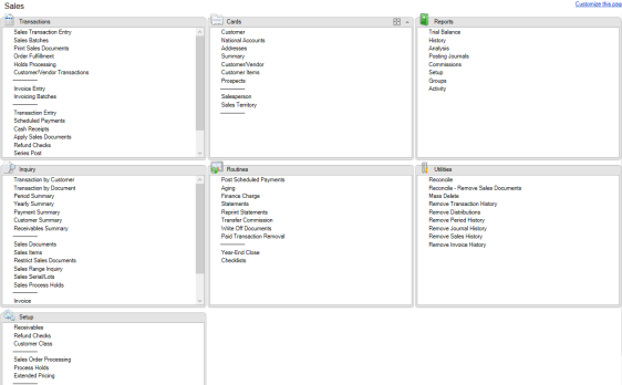
Another important and notable change that we have in GP 2013 is the module homepage being amazingly redesigned, much to users’ delight.
As compared to previous versions of GP (from 9), what you will see here is the complete menu without any collapse/expand functionality, but with a scrolling option within that small rectangle frame; which means you don’t have to scroll to the bottom of GP itself, but just scroll down within that frame, so you don’t have to scroll up/down to access other frames.
If you are trying to open Receivables Batches, I just have to scroll down on Transactions frame. When I am done, I won’t have to scroll up/down again to reach out to open Receivables Statements.
Cool, isn’t it? If you are heavy user of modules homepage for your day-to-day tasks, this is going to increase your productivity most certainly.
VAIDY

Feedback I’ve had from users is that the series area pages in 2013 are a downgrade from the 2010 versions of them, with options are squished into small frames in which the scroll wheel doesn’t work.
LikeLike
That’s quite strange. But also a valid point that you can’t scroll by mouse inside each frame. I still felt like it’s quite easy to navigate across frames. Unlike GP2010. Thank you for sharing your experience on this. Let’s listen from more customers and feel their pulse.
LikeLike
Yeah, across frames it works well but when you need to scroll down a frame it really doesn’t work well; it is a regression upon the previous version.
LikeLike
Pingback: GP 2013 Home Page (Re)Design Horrors | DYNAMICS GP - LEARN & DISCUSS